You put heart, hustle, and high fives into making your videos — now it’s time to show them off with style.
Switcher’s latest feature release puts you in the (Creative) Director’s chair. Now you can customize every aspect of the video experience for your viewers, from how your videos show up on your website, to how you share them. Complete creative control is in your hands!
Showcase your videos with Catalog and Collections
Picture a one-stop shop to manage, customize, display, and share a full gallery of videos with your audience.

Enter: the Catalog
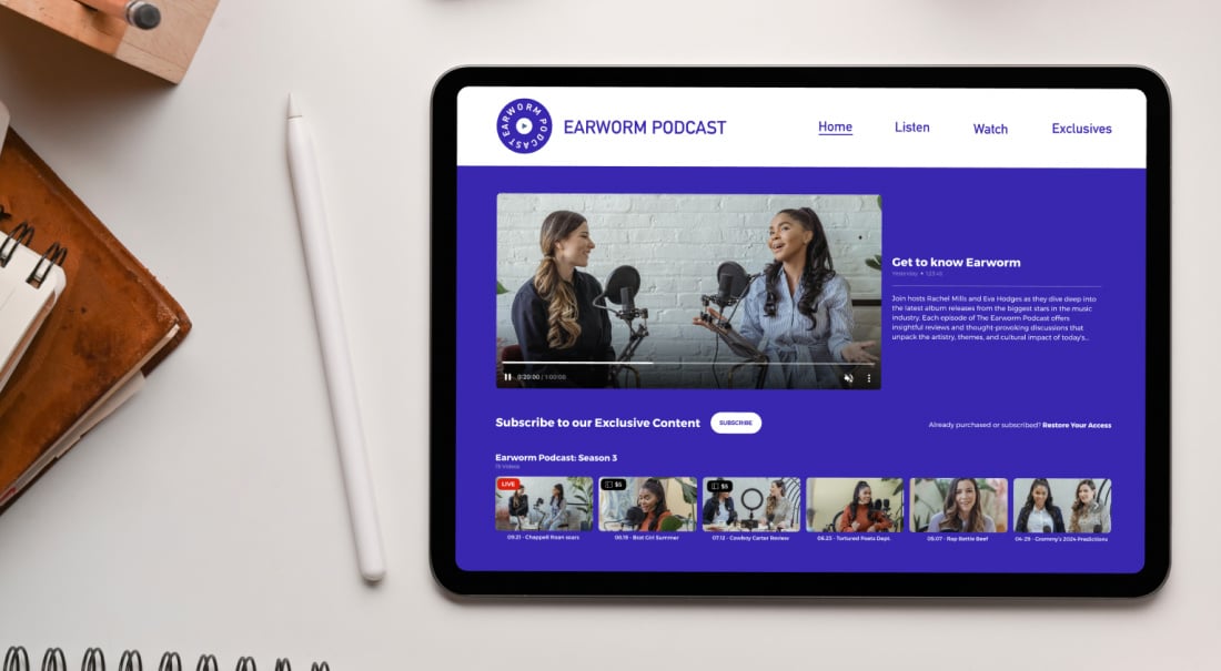
Visualize being able to arrange your videos in standalone collections, or give access to your entire video library in a single, Netflix-worthy watch page.
Throw in the ability to customize every aspect of the display, plus monetization options like subscriptions and pay-to-view passes, and voilà! This is the new Video Catalog.
.gif?width=1200&height=628&name=branded-video-experience%20(1).gif)
Now, with your Catalog, you’ll be able to create:
-
Gorgeous displays
Whether you want a sleek, scrolling gallery or a social media-style grid, your video collections will look amazing on your website or watch page. -
One-click magic
Quickly switch up the video order, layout, color scheme, and custom URL — or add a new payment structure for your full video line-up — and see it update automatically on your site or the standalone watch page. -
All-in-one video management
Manage and share your entire video library from one place, making it super easy to keep track of your video performance, charge fees, and update your Catalog view on the user-friendly Switcher dashboard — no coding required. -
Unlimited ways to package videos
Create infinite video playlists! There’s no limit to the number of collections you can create with the videos in your video library.

Ready to make it happen? Learn how to add a Video Catalog by visiting our Help Center here.
A seamless upgrade experience
If you're already a user, this upgrade is simple and optional!
Your current setup, including playlists and player displays, carries over automatically. The way your video players currently look on your website or watch pages won't change — until you take the reins in the dashboard.
Speaking of, here are some of the changes you'll notice next time you log in to your Switcher dashboard:
The name of Switcher’s web player functionality
Collections replaced the old Switcher Players terminology, but nothing you have embedded or shared is changing without you. That Switcher Player you already have on your site’s homepage? Your viewers won't notice a thing.
How you manage your videos
The CMS menu in the Switcher dashboard is even more user-friendly, with fewer clicks to get where you want. Plus, now you have more customization options for how your content is displayed, how you collect payment, and how you share your videos.
A tailor-made viewer experience
Those customization options we mentioned? Yep, we let you control the entire vibe.

- Reflect your brand’s personality in every detail with customizable color palettes, button CTAs, layouts, and more.
- Create custom URLs to skip the website hassle and direct your audience straight to your Video Catalog or individual Collections.
- Pick your layout: portrait, landscape, you name it. Your videos will look perfectly you.
- No ads, no distractions — just your videos, front and center. Our embeddable player options match your aesthetic, so your viewers enjoy a seamless experience.
Still have questions about Collections and Catalogs? Visit our Help Center.
Craft your perfect video experience
You’ve got the content, the brand, and the vision. Let Switcher help you create the ultimate video experience that’s as unique as you.
(If you’re new here, give Switcher a try free for 14 days. We think you’ll like it.)
It’s time to take charge and dazzle your audience!


