Download Switcher 4.3 on the App Store to get all these updates.
New to Switcher? Sign up for a free 14-day trial to take Switcher for a spin.
What's fresh from Switcher?
Check out our latest app updates and software release announcements.
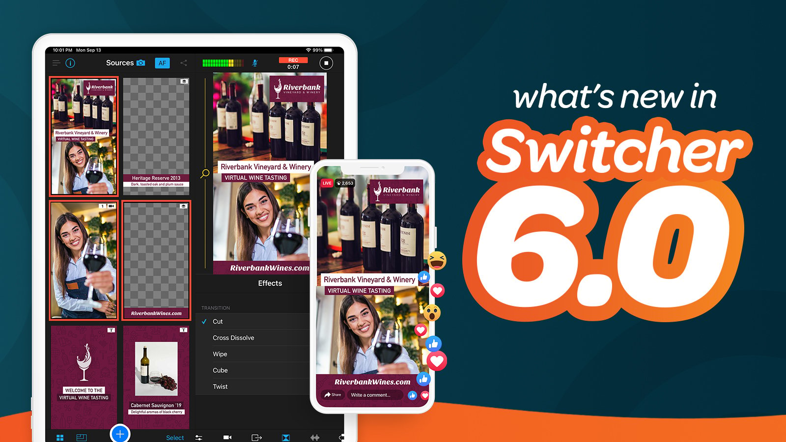
Your wait is over — today we’re releasing Switcher Studio 6.0, which includes the long-awaited ✨ Vertical Video Mode✨ along with all the new possibilities this format brings. Let’s jump in.
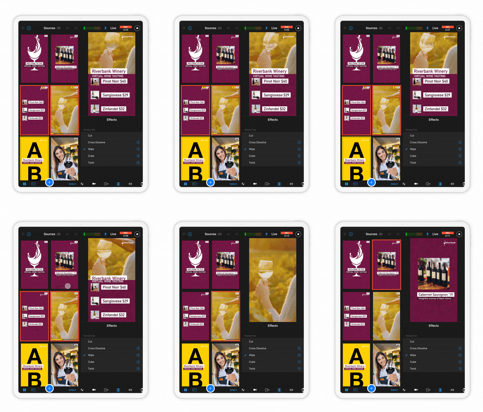 Whatever you call it — 9:16, portrait mode, or vertical video — we’ve brought it to Switcher Studio. Now when you log in to the Switcher app, just tap 9:16 before you tap Use As Switcher to take Vertical Video Mode for a spin. This layout is loved by audiences tuning in on their phones, and it’s now available for streaming to Facebook and YouTube. We’re still working to build all your favorite assets into this new mode, so don’t be surprised if some Multiviews and Scoreboard layouts aren’t accessible in Vertical Video Mode yet. As always, Horizontal Video Mode — and all your favorite assets — will still be available on Switcher for recording and streaming on nearly any platform.
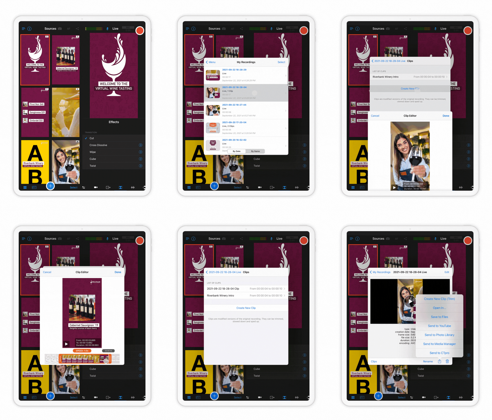 You know what’s fun? TikTok videos. You know what’s not fun? Editing TikTok videos. Why does it take 5 hours to stitch together a 1-minute clip? With the introduction of Vertical Video Mode, you can now use Switcher’s real-time editing tools to create multicamera videos for vertical video formats like TikToks, Stories, Reels, Snaps, and Shorts. Simply use the new clips tool introduced in Switcher 5.6 to save a portion of a previous vertical stream or just use recording mode to, ahem, shoot your Short. Then export your Switcher clip or video and upload it to your favorite vertical platform!
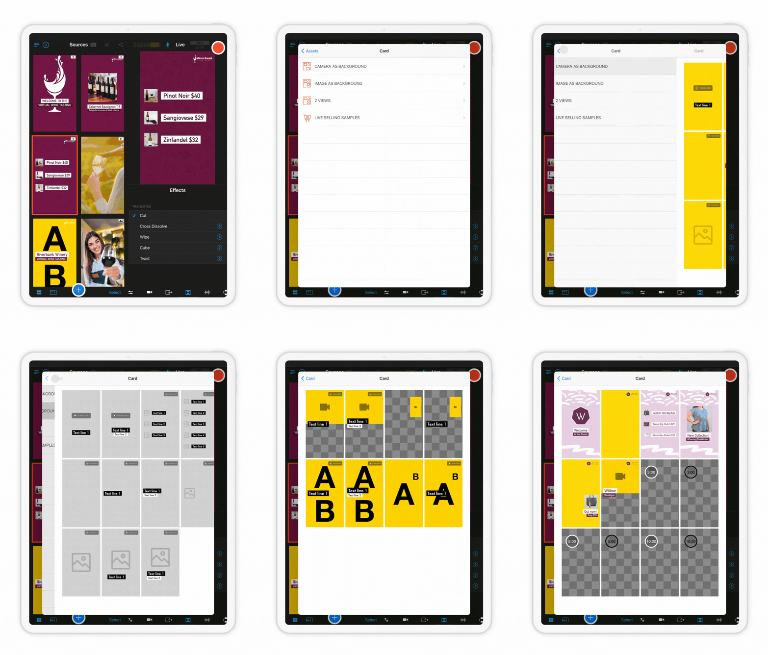 Have you gotten in on the live selling game? From Facebook to Amazon, the biggest sites are combining streaming and shopping to create a fun new way to shop online. In 6.0 we’re launching Live Selling Cards, which are like assets on steroids. Rather than choosing a Multiview template, a text overlay, and a logo graphic all separately, you can now choose a Live Selling Card to combine logos, graphics, text, and video sources into individual single-tap assets. Customize Cards with your product photos, brand colors, fonts, and more to instantly create all the elements needed for a polished shoppable video. To try out Live Selling Cards, tap the Plus button, and then tap Card.
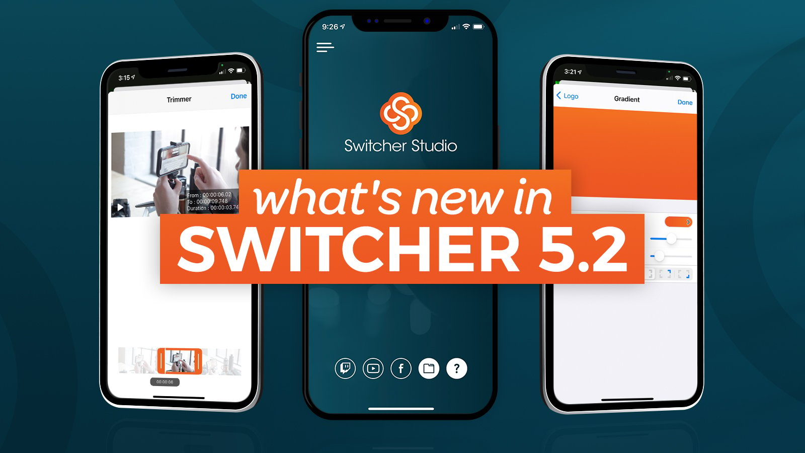
The holidays are upon us, including everyone’s favorite: Switcher Studio update day! Today we’re releasing Switcher 5.2, which includes automatic camera switching, the ability to trim prerecorded videos, LinkedIn Live scheduling, and more. So grab some hot chocolate — it’s time to unwrap these new features.
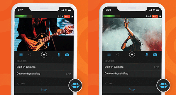 Sometimes your hands are occupied during a livestream — like when you’re streaming a handbell concert or the construction of gingerbread house. Thanks to the new autoswitching feature, you can set your camera angles to change automatically, keeping your video dynamic and your iPhone icing-free. You can find this feature on the new Autoswitch tab, which lets you choose a time interval for angle changes and tap start. You can also use the shuffle function to make the angle changes totally random. Tap any full-screen asset or source to interrupt the autoswitching and resume manual switching.
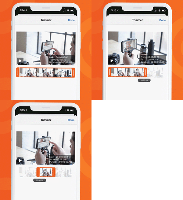 Trim your trees and your videos, thanks to the new trimming tool for prerecorded video assets. Now when you add a prerecorded video to your Switcher Production panel — whether an opener, a commercial, or another previously filmed video — you can trim the beginning and end of the video to get the exact clip that you want. Simply tap a video in your Production panel to reveal the Video Properties pop-up, tap the timestamp range beside Trimmer, and drag the trimming tool’s left and right edges to capture the video frames you want.
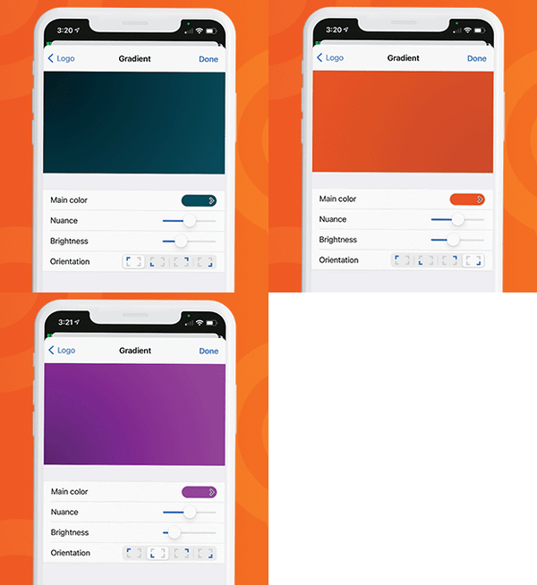 In our last two updates, we released the ability to add background colors and background graphics to your multiview layouts, and in this release, we’re expanding that capability further with customizable background gradients. When you’re creating a new multiview layout, simply tap Background image on the Properties pop-up, then tap Gradient. Choose the main color for your gradient and use the nuance, brightness, and orientation options to customize it and set the right tone for your stream.
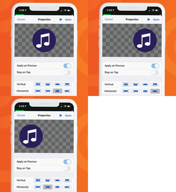 So that you can get your on-screen graphics *just* right, we’ve added new alignment options for your logos (and other partial-screen graphic overlays). Now when you add a logo asset to your Production panel and access its Properties pop-up, you can tap one of eight alignment options to center the asset vertically or horizontally, align it to any edge, or instantly scale it to fit the screen vertically or horizontally.
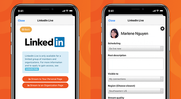 In keeping with the profesh nature of the platform, LinkedIn Live scheduling is now a thing! (What do professionals love more than scheduling things?) As with our YouTube and Facebook integrations, you can now schedule a LinkedIn stream in advance, making it easy to share your video’s URL, promote it ahead of time, and generate interest in your livestream. We’re excited to be one of the first LinkedIn partners to offer stream scheduling.
As usual, we also smushed a few bugs and made some UI tweaks, including adding the ability to turn Video Chat voice mode on and off manually.
If you want to learn about the updates and chat with us live, Switcher’s community manager, Matt Warmbier; senior video producer, Ryan O’Hare; and livestreaming producer, Morgan Davis, are going live on Facebook at 11:30 a.m. ET this Friday, December 11, to discuss the updates in more detail. Follow us on Facebook to get notified.
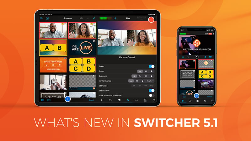
The Switcher team is back at it with another software release! The updates in Switcher 5.1 are designed to spruce up your livestreams by letting you further customize the look of your productions. This release introduces new title graphics and lower thirds plus the ability to add background images and background colors to your multiview layouts. As a bonus, we’re also adding a username and password autofill option to the app login!
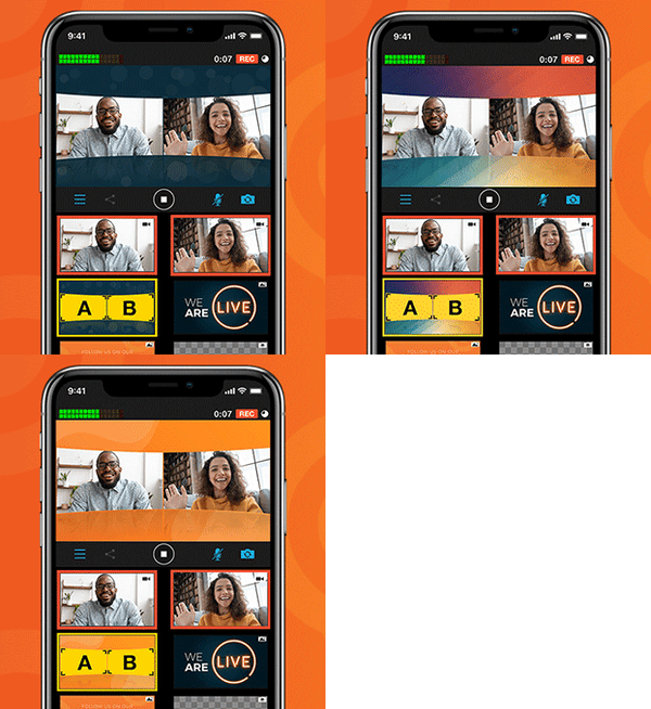 Switcher includes several multiview layouts that you can use to show up to nine of your sources at once during your stream. In 4.5, we introduced the ability to choose a background color for the grid multiview layout. In 5.1, we’re adding that functionality to two other multiview layouts: dashboard and flap. Even better, we’re also introducing the ability to choose background images for the grid, dashboard, and flap multiview layouts. Upload your own background image or choose from our colorful new background image templates. Background images are perfect for branding your stream or theming certain episodes.
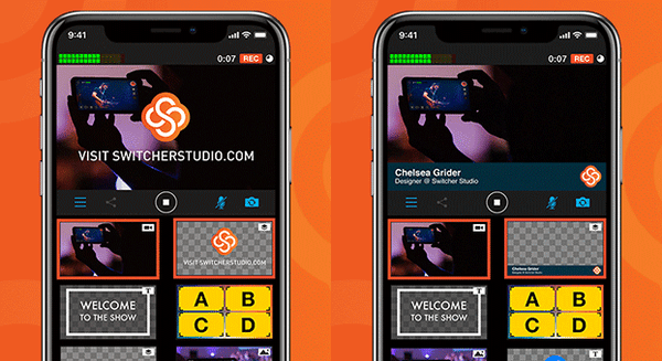 Much like our social overlays have built-in logos for each platform, we’ve added an editable logo slot to a new title template and a new lower third. You can customize these text templates by uploading your own logo, choosing one from Switcher Cloud, or inserting one of the social or donation logos used in Switcher’s other text templates. These editable logo slots will let you easily introduce a show, segment, sponsor, or speaker with your own branding — no need to create custom graphics.
We’ve added an autofill option to the app to speed up the login process! Now when you’re logging in, you can use the username and password saved on your device rather than typing in your credentials. Confirm access with your Face ID or passcode, and you’re in!
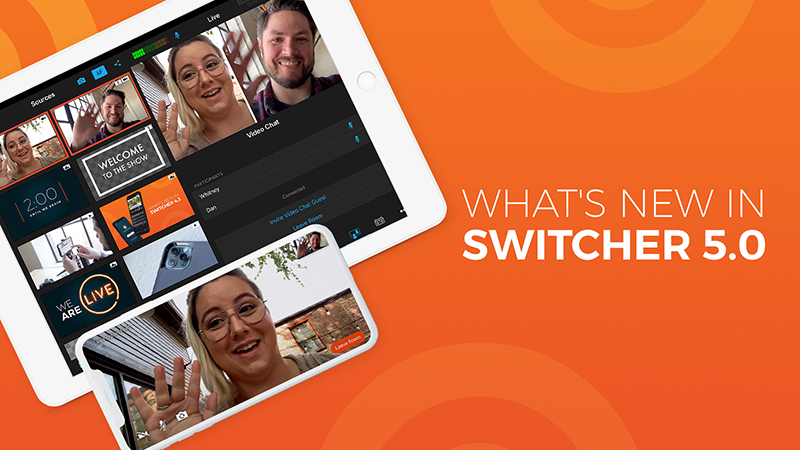
The latest update to Switcher Studio has arrived! Everything in this release is designed to make your experience with Switcher more streamlined. For instance, you can now upload creative assets to Switcher Cloud in batches rather than one by one. Genius, right? And you can turn audio monitoring on and off right inside the app. Bye bye, echo. You can even run Video Chat entirely from Switcher itself. Plus, everyone’s getting more Video Chat hours! It’s an update so big that it merits a whole new number (or if you wanna get nerdy, which we always do, a new whole number): Switcher Studio 5.0.
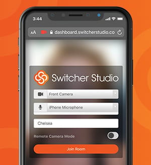 Say hello to in-app Video Chat. (Also, say hello to your remote guests because it just got easier to host them on your streams.) Until now, hosting guests has involved starting and joining a Video Chat from a browser and webcam on a second device. In Switcher 5.0, you can start, join, and invite guests to a Video Chat directly from the iPhone or iPad running Switcher. Do it all from a single device.
Additionally, your remote guests will be able to see your live video feed in real time in the Video Chat room. So whether you’re playing a prerecorded video, streaming a sporting event, or covering on-scene news, your guests will be able to see and hear what’s happening, making it easy for everyone to provide commentary.
Similarly, because Video Chat is all in-app, you’ll be able to hear your guests through your device’s speakers or headphones — and mute or unmute guests at any time. We’ve also introduced echo cancellation so you and your guests can hear each other without duplicating audio (... duplicating audio ... duplicating audio … duplicating audio). Oh, and we’ve mirrored everybody’s camera views to avoid breaking any brains. It’s just plain weird to see yourself forward instead of backward.
You get more Video Chat hours, and you get more Video Chat hours, and you get more Video Chat hours! Everybody gets more Video Chat hours!
As part of our efforts to give you more access to livestreaming during social distancing, we extended Video Chat hours and in-Dashboard Custom RTMP access from March-June 2020. Well, you guys loved it, so we’re hereby adjusting our plans to incorporate these changes. The Standard and Plus plans, which previously had 30 and 100 hours of Video Chat time per month respectively, will now have unlimited Video Chat time. The Plus plan is also getting another remote guest slot — host up to five guests at once. And the Essentials plan, which previously had 5 hours of Video Chat time per month, will now have 120 hours per month. That means you could have a 4-hour Video Chat livestream every 👏 single 👏 day.
Video Chat Access by Plan |
||||||
| Essentials | Standard | Plus | ||||
| Video Chat Hours | Remote Guests | Video Chat Hours | Remote Guests | Video Chat Hours | Remote Guests | |
| Pre 5.0 | 5/Month | 1 | 30/Month | 2 | 100/Month | 4 |
| Post 5.0 | 120/Month | 1 | Unlimited | 2 | Unlimited | 5 |
Additionally, we’re making Custom RTMP setup available in the Dashboard on all three plans. Custom RTMP lets you connect to lots of streaming destinations beyond our direct-integration platforms, including third-party multicasting platforms. So now you can stream to more places more easily.
We’ve also beefed up the Audio tab to give you more control over your videos’ sound. A new toggle lets you turn audio monitoring on and off before or during your stream — right inside the app itself. Previously, you had to go into your device settings to control this, which resulted in some people unknowingly leaving it on and then experiencing echo. We suggest turning audio monitoring on before your stream to check audio levels and then turning it off during your stream to prevent echo (or using headphones if you want to keep an ear on things). You can also view each remote guest’s audio level right in the Audio tab now, making it easy to mute and unmute as needed.
Speaking of monitoring audio, you’ve always been able to monitor audio with bluetooth devices, but now you can connect bluetooth device mics to Switcher as well. That means you can use your AirPods’ microphone or another bluetooth microphone as the audio source for your production without even introducing an audio mixer.
Remember in-person events? When we could like … hang out with people? Many of those are still on hold these days (le sigh), but not so for LinkedIn Events, which let you organize gatherings, invite guests, and converse with other attendees online (also in person, once that’s a thing again). And now you can stream (as your company page) directly to these LinkedIn Events from Switcher Studio — helping you capture a little more of that in-person feel with real-time video. All you have to do is paste your LinkedIn Event URL into a new field when you’re setting up a LinkedIn stream in the Switcher Dashboard.
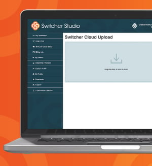 Good things come in batches — like cookies … and creative assets for your videos. (OK, admittedly, all of our other examples were also baked goods.) We’ve introduced batch uploading in the Switcher Dashboard so that you can drag and drop all your assets into Switcher Cloud storage at one time. So if you get a whole new batch of sweet on-brand creative — think graphics, prerecorded video, or custom lower thirds — you can add all the files to Switcher quickly. And once your assets are in Switcher Cloud, you can instantly access them from the Switcher Studio app and use them in your productions.
Did you spot the other update in that paragraph? Yes, you can now upload prerecorded video to Switcher Cloud storage right from the Dashboard. Previously, to add videos to Switcher Cloud, you had to add them to the Switcher app’s Production panel first and then push them to the cloud. Uploading videos from the Dashboard should make it way easier to get openers, b-roll, credits, and more right from your computer into your productions.
Now for the more technical stuff. If you’ve ever submitted a support request to our amazing Support team, they might have asked you what app version you’re running. We added a new Diagnostic Data panel to the app’s main menu to make it easy for you to find that info. In this panel, you’ll also see a toggle for diagnostic logging, which, when enabled, automatically creates logs for the next 4 hours while you use Switcher, making it easy to provide Support with information about your app use. You no longer need to remember to turn diagnostic logging on and off each time you stream.
We’ve also added a CPU load monitor that notifies you when your CPU (or central processing unit for our fellow nerds) gets overloaded. Nobody wants an overloaded CPU. Per usual, we’ve also fixed some bugs and improved stability.
Today our developers are rolling out yet another update — Switcher Studio 4.5. Doesn’t it feel like they just released 4.4 like two days ago? Or was it two weeks ago? Is time still a thing? Here’s a look at what they were able to build from their basements while we’ve all been social distancing. The update includes more flexible multiviews, a new color picker, customizable donation overlays, easier ways to screenshare, Video Chat upgrades, and more. Are you thinking what I’m thinking? Let’s never let them out of their basements.
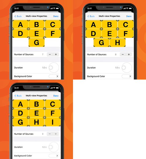
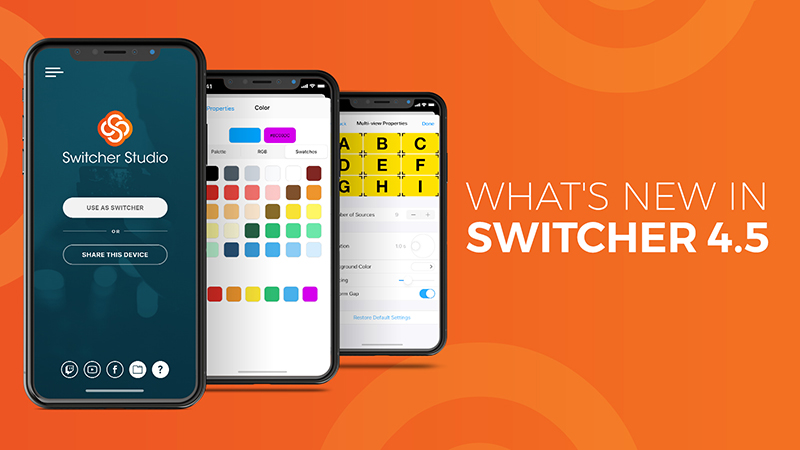
Though you’ve long been able to connect nine video sources in Switcher, you’ve historically been able to display only four sources at one time in your stream itself. Well, take that power and double it ... and then add one more. Now you can display all nine of your sources in your stream at a single time thanks to an updated grid multiview layout. Insert the Brady Bunch theme song here. You can also use fewer slots — which is great, for instance, if your family does not have an Alice. In addition to controlling the number of source slots, you can now set a background color for your grid multiview. On a related note, we’ve also updated the dashboard multiview layout so you can manually adjust the perspective effect.
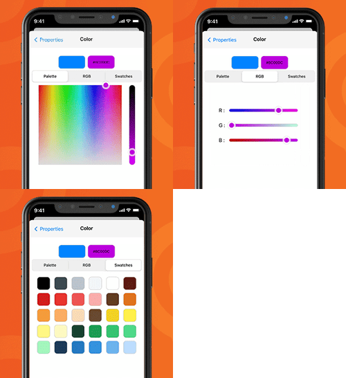
Every artiste 👩🏼🎨 needs a palette, and you are a livestreaming artiste. For this reason, we’re introducing a new color picker tool, which includes a classic rainbow palette, RGB controls, a Hex/CSS code field, and suggested colors. (So many ways to, ahem, peruse and choose the hues to use.) You’ll also get six empty swatch slots where you can save your brand colors to create your own custom palette. These savable swatches will ensure you can quickly generate on-brand titles, lower thirds, broadcast notifications, and grid multiview backgrounds.
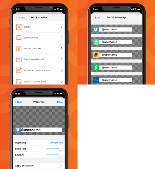
Whether you’re taking tips during a musical performance, asking for donations during a fundraiser, or accepting an offering during a worship service, there are plenty of situations in which you want to give viewers the option to donate. (You may also just want to invite viewers to give you money for the sake of giving you money, in which case more power to you.) To make this easier, we’re rolling out customizable CTA overlays for all the biggest donation platforms. Simply add your username or brief giving instructions beside the logo for the following platforms and tap to display it in your stream:
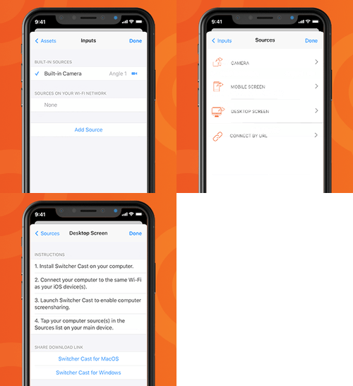
First of all, did you know that you can screenshare an iOS screen right into your Switcher stream? It’s true — and it’s perfect for demonstrating apps, websites, or yourself getting sucked into the vortex that is TikTok. Second of all, the process for sharing that iOS screen just got easier. Now it’s as simple as connecting an additional iOS camera; in fact, the first step is the same. On the launch screen of Switcher, simply tap the new Share this Device button, then choose whether to share your screen or your camera.
You can now include both a Video Chat guest and their computer screen in your livestream at one time. This is ideal when your remote guest wants to share a website, presentation, or app but you also want viewers to see their lovely face. Your guest’s webcam and screen will show up as a single guest in the Video Chat tab but as two sources in the Sources panel, which means you can use any multiview layout to display your guest and their screen alongside your other sources.
Speaking of sources, we’ve introduced a new Add Source button in your Inputs tab, which will make it easier to connect your main device to additional devices on your Wi-Fi network. When you tap the button, you’ll be able to choose whether you want to add another iOS device camera, an iOS device screen, or your computer screen. Simply tap the source type you want, and you’ll be shown simple steps for connecting it. If you’re having trouble finding a device on your network, you can also manually enter the URL of the device you’d like to add.
In our last update, we rolled out a Twitch integration that lets you connect and stream to Twitch directly without RTMP info. Now we’ve made streaming to Twitch even easier by adding a Twitch shortcut to your launch screen (right beside the YouTube and Facebook shortcuts). Tapping the shortcut lets you set up a Twitch stream without having to go to the Outputs tab.
Facebook Live is getting a lot o’ traffic these days for obvious reasons. That means it’s more important than ever to stream to Facebook using a video quality setting that’s suitable for your Wi-Fi network’s upload speed. We’ve added a new Test Speed button to the Facebook stream setup (both in the app and on the Dashboard) so that you can see your download and upload speeds before you go live. Based on your speed results, Switcher will automatically suggest the appropriate stream quality: low, medium, high, or HD. You can manually override the quality suggestion, but you might see dropped frames or streams.
LinkedIn Live users are also getting some love! We’ve added the option to set geographic and language restrictions on your LinkedIn Live videos. This is ideal for companies whose streams will be relevant only to certain geographic regions or those whose audiences may speak a wide variety of languages. No sense streaming a video in Danish to those who don’t speak it, amiright? (Although I think we can all enjoy eating a Danish.) You can enable and customize these restrictions right in the Switcher app when you’re setting up your LinkedIn stream.
Per usual, this update also includes a couple of bug fixes and stability improvements. Director Mode now correctly transfers journal files to Switcher Media Manager on your Mac. Additionally, when you move a video file out of Switcher and into your Photo Library, it now no longer shows up as an alias within Switcher. No actual bugs were harmed in the smushing of these bugs.
Download Switcher 4.5 on the App Store to get all these updates.
New to Switcher? Sign up for a free 14-day trial to take Switcher for a spin.
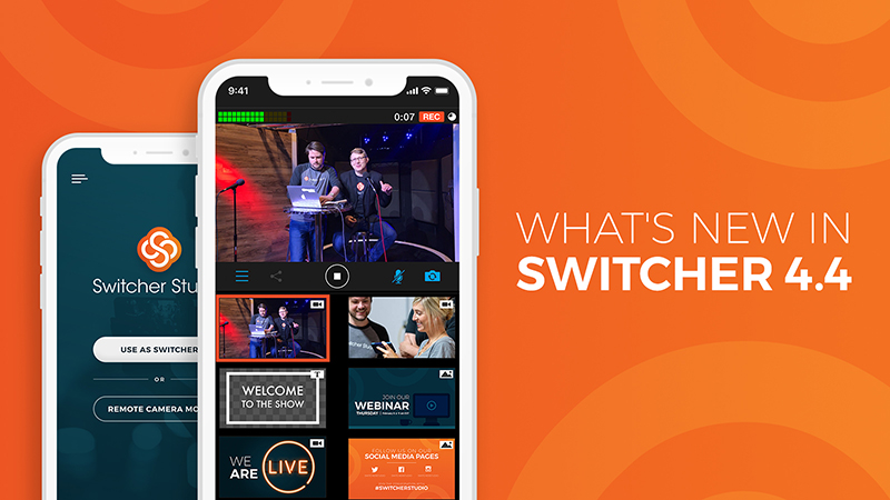
This week we’re gradually rolling out Switcher Studio 4.4, which includes both form and function updates to the Switcher app. It will be available to all Switcher users over the course of the next few days. So be on the lookout for these changes soon, and check out what’s new below.
T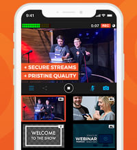 he footage from your additional camera angles just got smoother. We’ve updated the way your iOS devices communicate so that more video data can be transmitted from your secondary devices back to your main switching device, and the visual difference is stunning. The Switcher app will also now monitor performance on your additional devices, prompting you to change your latency settings if it detects performance issues. It’s easy to change your latency settings mid-stream to ensure smooth video.
Say hello to the new direct Twitch integration! You can now link your Twitch account to your Switcher account for instant streaming, no RTMP info required. Once you’ve linked your accounts, Twitch will show up as a broadcasting platform option in your Outputs tab, just like our other platforms with direct integrations (Facebook Live, YouTube, LinkedIn Live, and Microsoft Stream). The direct integration with Twitch is available on all three Switcher plans.
Ensure high-quality discussion on your Facebook Live videos by choosing a chat moderation setting. Now when you set up a Facebook post to stream to, you can choose from several chat settings before going live:
LinkedIn Live is still in beta and available only to select streamers, but for those who are using Switcher to stream to LinkedIn, we’ve introduced support for LinkedIn Live’s draft mode. Draft mode lets you test all aspects of your LinkedIn Live stream without actually publishing a video for your followers. Test your cameras, angles, sound, etc., without any risk. Perfect everything before going live for real.
Until now, if you wanted to find your previously recorded Switcher videos, you could access them from the My Recordings submenu (found within the Plus button menu) or the Recorded Media submenu (found within the main menu). Videos were distinguished from each other by their timestamps, which sometimes made it hard to find the right one. With the launch of 4.4, we’ve added the ability to customize these videos’ names. You can then sort the videos by name or by date. You’ll also be able to see the duration and time stamp for each video. Additionally, we’ve standardized the aforementioned My Recordings and Recorded Media menu items — now they’re both called “My Recordings.”
 In Switcher 4.3, we introduced a redesigned Plus button menu that made assets easier to access and insert into videos. We’ve now redesigned the main Switcher app menus (accessible from the launch screen and home screen) to match that look and feel. The new menu design features simple, highly legible buttons to ensure you can navigate the app as quickly as possible. Now you can also dismiss menus and other panels with the simple swipe-down closure motion introduced in iOS 13.
New to Switcher? Sign up for a free 14-day trial to take Switcher for a spin.
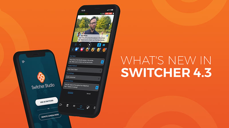
Happy Switcher Studio update day! We’ve been working on the enhancements in today’s 4.3 release for quite some time. We’re thrilled to introduce asset storage, make our multi-user plan more accessible, bring Video Chat to everyone, and turn a number of your requests into a reality. Below you’ll find an overview of the biggest additions and improvements. But before that, we wanted to introduce you to a new plan structure!
It’s been a year since we first introduced multiple plan options, and in that time, we’ve learned a lot — and added several new features. Our new plan structure will better accommodate the myriad ways in which you guys are using Switcher. You don’t always identify as “Personal” or “Professional” users, and features can’t easily be divided into those categories either. So here’s our new approach: Moving forward, every primary feature will be available on every plan — i.e. Video Chat and Switcher Cloud (new!) are now for everyone. As you grow into higher plans, you get more access to those features — more asset storage, more Video Chat minutes and guests, etc.
We’re also renaming our plans to better convey their differences: Essentials, Standard, and Plus. As these names indicate, what varies among plans is the level of functionality, not the type of user. This plan structure lets you choose the feature capacity you need for your streams — and the plans grow as you do. (See a complete plan comparison.)
| Wondering which plan you’re on? Here’s how the old plans correspond to the new ones: | |
|---|---|
| If you were on this plan: | You'll be on this plan: |
| Personal | Essentials |
| Professional | Standard |
| Switcher for Teams | Plus |
Now for the updates:
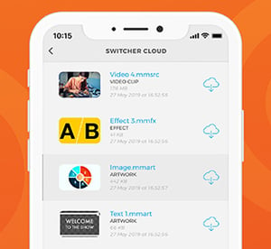
Say hello to Switcher Cloud. We’ve introduced it as a way to let you store the assets you insert into your videos made with Switcher — like logos, graphics, prerecorded video, text, and overlays. You can upload these assets to the cloud directly from the app or from your online Dashboard.
Once these assets are stored in the Switcher Cloud, you can access them on any device logged into your Switcher account and then sync them so they show up in your Sources panel. That means you no longer need to worry about whether all the assets for your livestream are stored locally on your main switching device. (This also solves the issue some people have run into when trying to add transparent PNGs to Switcher. Now you can just upload your PNG to the Switcher Cloud from your online account in the Switcher Dashboard and then sync it to your device.)
Switcher Cloud storage is coming to all three plans — the Essentials plan lets you store 20 assets; the Standard plan lets you store 100; and the Plus plan lets you store 500 (plus 100 per additional user).
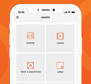
Speaking of assets, we’ve redesigned the Plus menu to make your assets easier to access within the app and easier to insert into your videos. Now when you tap the Plus button under the Sources panel, simple icons will prompt you to choose the type of asset you want. After that, a folder view will let you choose where you want to access that asset from — be it your Switcher Cloud, your Photo Library, a USB drive (new!), your folder of locally imported assets, or elsewhere. By letting you drill down, this redesign lets you find the right asset faster.
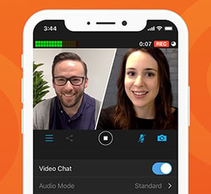
We know you’re excited for this one: Video Chat is now available on all three Switcher plans! Video Chat, which we introduced with Switcher 4.0, lets you bring a co-host, guest caller, or interviewee onto your live show. Your guest can join your stream just by clicking a link on their smartphone, computer, or laptop — no special downloads required. The Essentials plan now includes five hours of Video Chat time and the ability to host one guest at a time. The Standard plan includes 30 hours of Video Chat time and the option to host two guests. And the Plus plan includes 100 shared hours of Video Chat time (plus 30 per additional user) and the option to host up to four guests simultaneously.
Sometimes you need a closer look, and when you do, digital zoom will only get you so far. (Unless you’re on CSI, in which case yelling “Enhance!” will always get you as much digital zoom as you need.) So in 4.3, we’ve introduced support for the iPhone’s telephoto lens — which lets you use optical zoom to get a much clearer, closer look at your subject. You’ll be able to access your telephoto lens just by tapping the camera rotation icon that has historically swapped between your rear and front-facing cameras. (The telephoto lenses are built into the iPhone 7+, 8+, X, XS, XS Max, 11 Pro, and 11 Pro Max.)
You can now invite your guests to a Video Chat right inside the Switcher app — no more switching back and forth to your email or text apps. You’ll still need to log in to your online Switcher Dashboard as the host on another device so that your guests can see and hear you, but once you’ve done that, a new button in Switcher’s Video Chat tab will let you invite your guest via email, text, Slack, etc., without leaving the app. Plus, a simple toggle within the tab will now bring those guests in as sources instantly. Your app’s Video Chat tab will also now show how many minutes and guest slots you have remaining on your plan.
We’ve redesigned the first screen you see when you open the Switcher app, and it looks super cool. (We hope it will inspire you to create videos that also look super cool.) Additionally, the homescreen now includes a new shortcut that lets you quickly access your recorded videos from previous Switcher sessions.
We’ve added another customizable Scoreboard template to give you greater control over the look of your sports streams. This one is horizontal, taking up less vertical space so that your viewers can see moar sportz. Stick it to the top or bottom of your screen to maintain a nice roomy shot.
A bunch of you have asked us if you could link your individual Switcher accounts to a Plus account (formerly Switcher for Teams) — or multiple Plus accounts. (We get it: You’re popular.) Well, we made it happen. Now you can:
These options will be super useful for freelancers and consultants. They’ll also be especially beneficial for enterprise organizations looking to let more people participate in the creation of video content while standardizing how video gets made across the company.
Like we just said, you can now upgrade to the Plus plan right in your online Dashboard — no PDF contract required. (You can also add extra user seats in the Dashboard.) If you have any questions about Plus or want to add more than a handful of additional seats, you might want to talk to our sales team for personalized support.
If you use an iPad as your main switching device, you’ll be familiar with the Inputs tab (in the tab bar), which lets you add and choose camera sources. In the past the Inputs menu was tucked away in a separate menu on the iPhone interface, which made it take one too many taps to access. We’ve rectified that and put the Inputs tab in the iPhone tab for quicker and easier access on your phone.
Download Switcher 4.3 on the App Store to get all these updates.
New to Switcher? Sign up for a free 14-day trial to take Switcher for a spin.
It’s everyone’s favorite day — update day! We’re rolling out Switcher Studio 4.2, which includes enhancements to the Video Chat extension as well as greater audio controls and more options for customizing your inserted videos.
Download the updated Switcher Studio app from the App Store to get these exciting upgrades. (If you don't already have one, you'll need to create a Switcher Studio account to use the app.)
Switcher has long enabled you to share your own computer screen via our Switcher Cast desktop application. Now a Video Chat guest can also share their computer screen! (When a guest is sharing their screen, it will replace the webcam video of the guest.) This is perfect for demonstrations and calls-to-action, enhancing the power of Video Chat by enabling guests to become more involved in your video.
Additionally, Video Chat hosts can now view guests at full-screen. (Guests have always been able to be full-screen in your video production itself.) This makes it easier for you as a host to see the guest you’re communicating with or the screen they’re sharing.
The latest update also lets you set custom thumbnails for your inserted/prerecorded videos, making them easier to find. Inserted videos are often used to show openers, special segments, earlier happenings, or b-roll. Previously, it could be difficult to identify a specific inserted video, especially if it started on a black frame.
Inserted videos also have two new progress bars (shown when a video is playing) to help you see exactly how much time is left on the clip. This lets you prepare for a smooth transition to your next source. The first progress bar depicts the length of your entire video, and the second depicts the final three seconds of your video so you know exactly when it will end.
Now you can also manually adjust the volume level on any inserted video (or mute it entirely).
Additionally, you can set any inserted video to end on black or freeze on the final frame. This gives you greater control over how a video will look as it concludes during your stream or recording. (By default, it will freeze on the final frame.)
This update sounds good: New audio controls let you manually boost the volume of incoming sound by six or 12 decibels. This will be particularly helpful when your audio input isn’t loud enough or your built-in mic is too far away.
Audiophiles can also now route left audio to right or vice versa. Additionally, you can use sum-to-mono to play left and right audio on both sides. These enhanced controls will make it easier to use Switcher with third-party audio mixers, specifically digital audio mixers or simple mixers with few controls.
Choosing your Facebook stream destination now takes one step instead of two. Rather than choosing your destination type (timeline, page, or group) and then choosing the destination itself, you’ll now see a single list of all destination options.
Once you choose your destination, the profile image of the timeline, page, or group you’ve chosen appears so you can go live with confidence. This will help you quickly determine if you’ve chosen the right destination. Additionally, rather than having a permanent default destination, Switcher will save the destination you streamed to most recently. (Every time you stream to a new destination, that one will become your default.) We also introduced a new settings menu that will give you easy access to all of your scheduled streams.
Many users rely on HDMI output to show their Switcher productions in real time on monitors or projectors. But sometimes this output is shown with a thick black border due to various monitors’ overscan compensation. We’ve introduced underscan control so that you can manually or automatically remove these black borders, ensuring your video output can fit any screen.
Today we’re rolling out Switcher Studio 4.1, the first round of major platform enhancements since 4.0 released in January. Download the updated Switcher Studio app from the App Store to get these exciting upgrades, plus standard bug fixes and stability improvements. (If you don't already have one, you'll need a Switcher Studio account to use the app.)
We’ve made the Facebook comments extension more interactive. Now, if you're on the Professional plan, you can favorite comments you’d like to save (all comments are shown in real time in the Comments tab of Switcher), or you can tap them to display instantly in your video.
Some of you let us know you’d had trouble adding new assets (like graphics, logos, B-roll, or other prerecorded videos) to your Sources panel. For instance, if you already had a lot of assets and sources displayed in the Sources panel, you’d have to scroll past all of them to access the option to add more. We’ve added a new Asset toolbar at the bottom of your Sources panel to eliminate this pain point. A big blue plus (+) button, displayed at all times, lets you add assets without scrolling. We’ve also added a new Select option that lets you select and edit or delete multiple assets at one time.
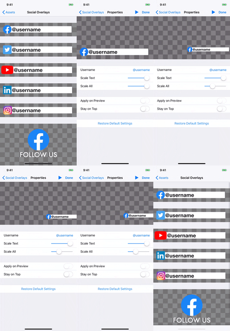
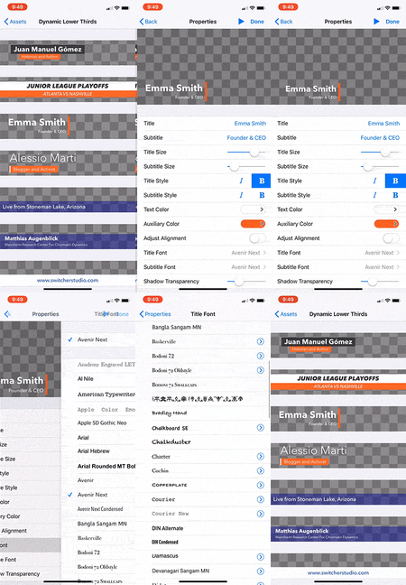 Customize lower thirds and social media handle overlays
We’ve added more customization options for lower thirds and social overlays. You can now scale and move social overlays — making them bigger or smaller and repositioning them within your video. You also have more control over the fonts used in social overlays and lower thirds. Additionally, we’ve updated the Facebook lower third to match Facebook’s latest branding.
For those who love Video Chat, we’ve created the new Auto-Refill setting, which ensures you’ll never run out of Video Chat minutes. When you turn on Auto-Refill, you’ll get 300 minutes (5 hours) of Video Chat time automatically added to your account any time you exceed your previous Video Chat minute allotment. You’ll be billed for these 5-hour blocks ($10) at the beginning of the next month — keep in mind that minutes do not roll over from month to month.
If you bundle, sell, or manage Switcher-related services for clients, you’ll be interested in our new Switcher Reseller Dashboard. The Reseller Dashboard lets you prepurchase Switcher accounts or features at a discount and then resell them to your customers with unique redemption codes. If you’re interested in getting access to the Reseller Dashboard, email marc@switcherstudio.com.
We’re constantly working to improve your experience with Switcher, and we have way more upgrades on the docket. If you have questions about any of the new features or changes, feel free to reach out to support@switcherstudio.com. Want to try Switcher for yourself? Sign up for our free 14-day trial to get started.
LinkedIn is launching live video, and they’re partnering with live-video software startup Switcher Studio as part of the launch. The Microsoft-owned professional networking platform, which boasts more than 610 million users worldwide, has dubbed the new feature LinkedIn Live.
After first launching (non-live) video features just 18 months ago, LinkedIn saw an increase in engagement and strong user interest in livestreaming capabilities. Video quickly became the fastest growing format on the LinkedIn platform, and live video became the most requested feature. This mirrors the growth of video content elsewhere on the web. Facebook, for instance, reports that live video is its fastest-growing and most-engaging content format.
LinkedIn Live is currently a pilot and accessible to individuals and organizations on an invite-only basis, but LinkedIn will soon introduce a process for members to apply for the feature. Live video content will be in line with the professional community LinkedIn is known for. Videos may include live Q&A sessions, events and conferences, product launches, company announcements, expert advice, and more.
LinkedIn’s professional focus makes Switcher Studio a natural fit for partnership. Switcher will enable users to create and stream polished live videos directly to LinkedIn from their mobile devices. Users can edit video in real time, roll in text and graphics, hosts guests, sync iOS devices for multiple angles, and more — all to create the dynamic, pro-quality content expected on a site like LinkedIn.
“Switcher Studio is thrilled to be partnering with LinkedIn,” says Switcher CEO and co-founder Nick Mattingly. “Live video is already changing the way that businesses and professionals interact with audiences and with each other, and there’s no better place to reach these audiences and foster conversation than on LinkedIn.”
Enter your search terms and hit ENTER or use ESC to exit
